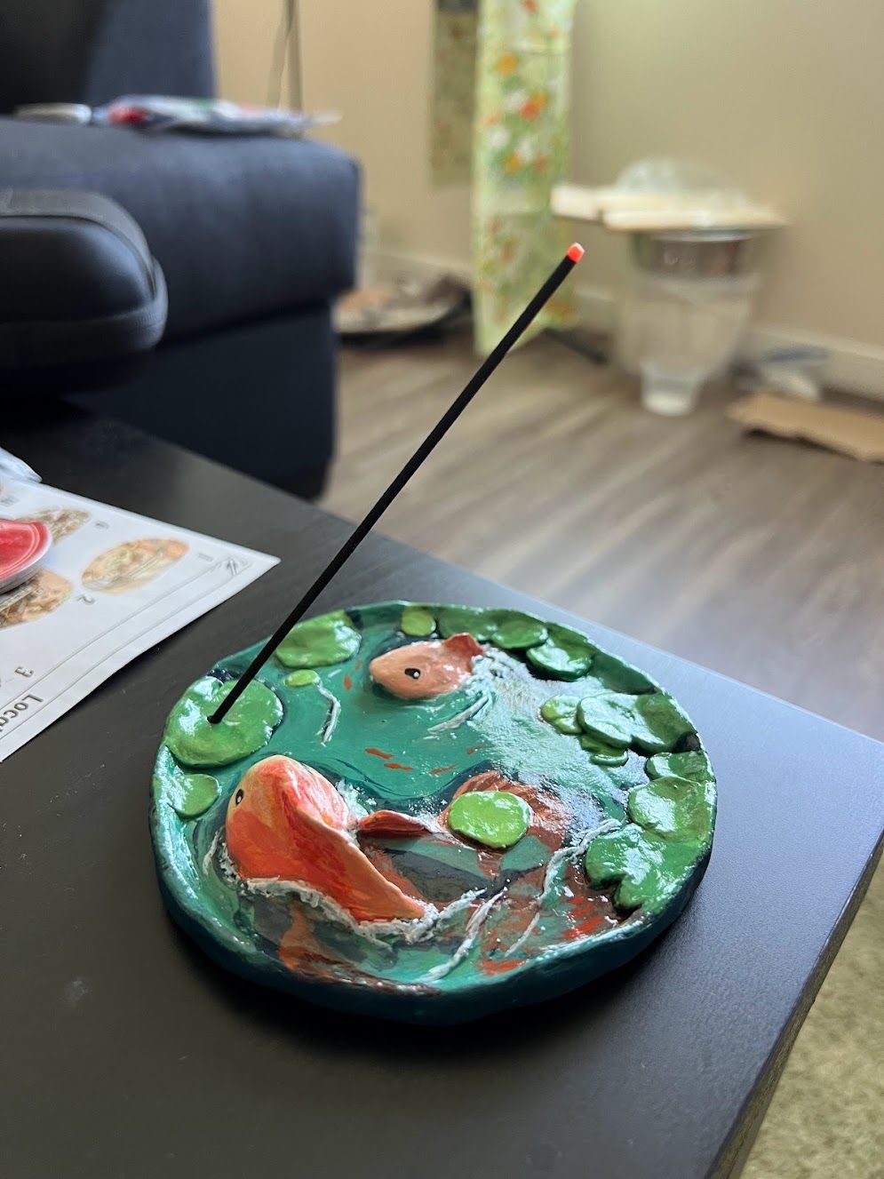
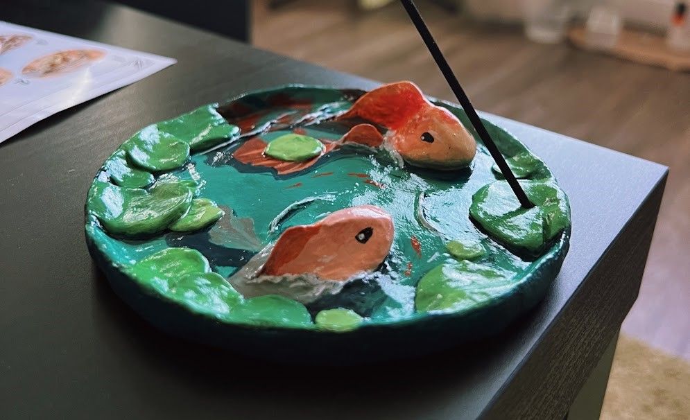
A lily pond incense holder

Making this tray was a little bit harder. Its based off of several digital paintings of fish in lakes among lily pads. There were more details, like the lily pads and fins. I also had to translate a 2D image into 3D. The most difficult part was shaping the fish above the water and painting the rest of the body on a flat surface. Thinking in both realities 2D and 3D was a fun challenge.
Another challenge was making sure I did the small details last. Since the clay dried fast, I had to add water to keep it from drying out. I ended up neglecting the outer side of the dish so I lost my chance to shape it better while it was still wet. I could have soaked it with a bit of water, but I was already done and not patient enough to go through the process.
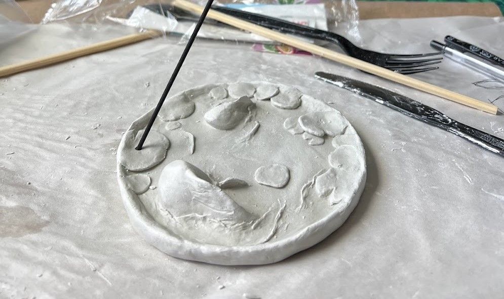
This is the piece with the finishing touch- making a hole for the incense. It was actually an afterthought to make it an incense holder. At the beginning it was going to be another jewelry dish. But I figured if someone used it to place their jewelry then they wouldn't be able to see the intricate painting.
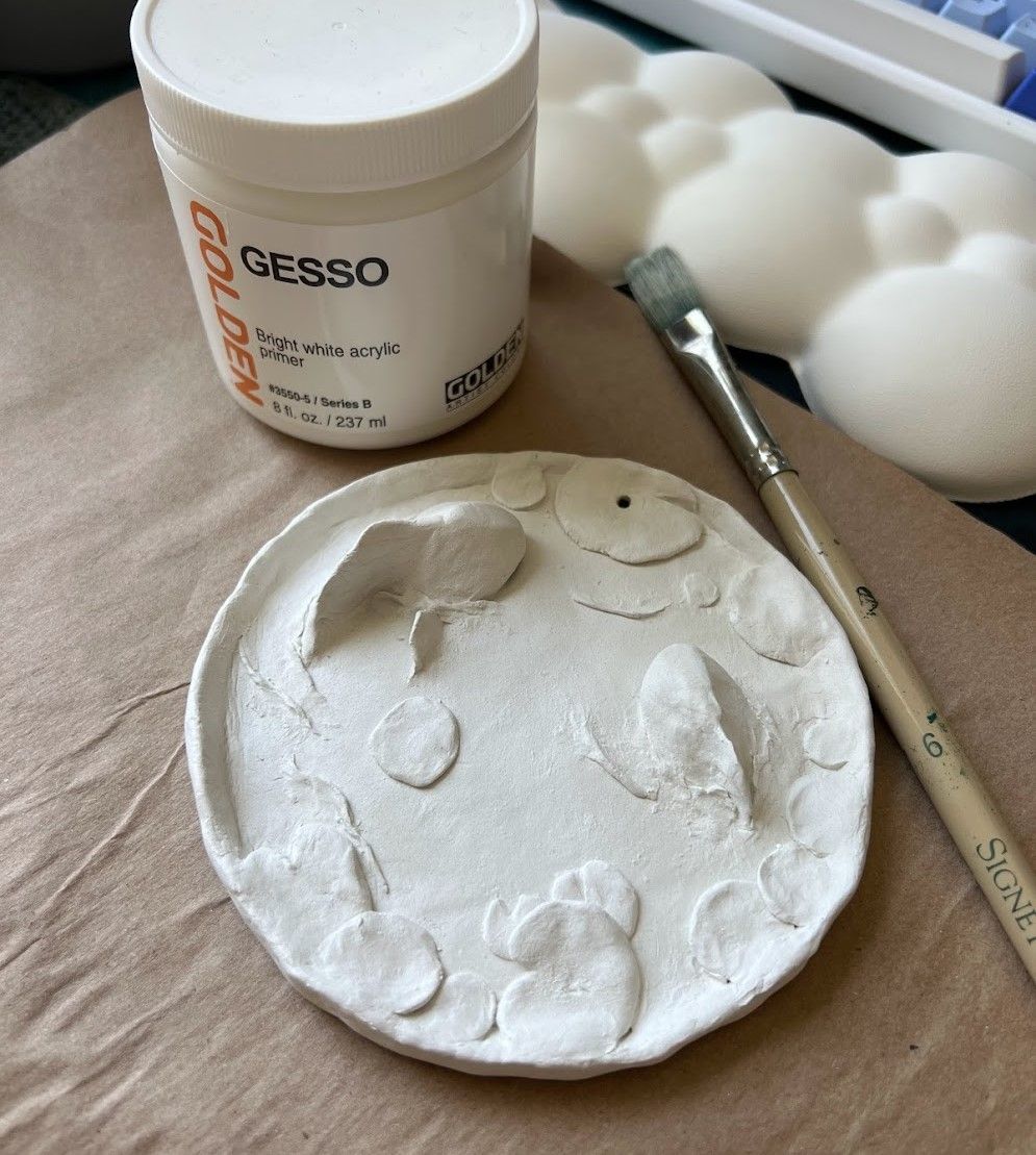
This was the piece after painting it with a base layer of gesso.
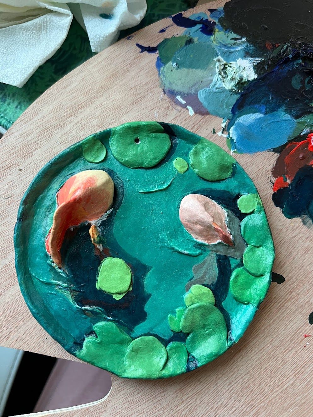
Painting was difficult. I went through maybe 3 layers of blue coating to get the right shades that complimented each other. I decided on a teal blue and light green. The fish were a peach orange.
Choosing a palette was only the beginning of the struggle. Painting a fish underwater, around the lily pads, and through the waves proved to be challenging. In the end, I discovered that I flattened the head of the smaller fish too much that it looked a little bit like a pink flat fish. The head of the other fish was too raised, and the fin was too large for the angle I imagined the fish to peer out. I accepted my mistakes, and near the end it became enjoyable to add the details.
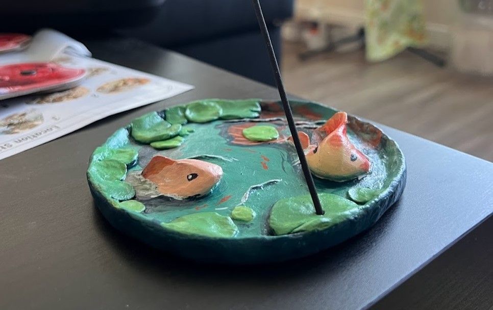
This was the dish prior to adding a gloss varnish.
In the image below you can see the details of the larger fish underwater. It didn't have to be perfect because of refraction. I'm proud of this work, but it didn't feel quite like my style. Likely because I referenced stylized artistic work rather than real images. It's a fun theme to work with though. Maybe I'll try other projects that mix 2D and 3D properties. Enhancing 3D surfaces with 2D details is really rewarding.
